
Stop Chasing Individual Failures: The Case for Flaky Test Grouping
Why a dedicated dashboard — not your CI tool — is what your team actually needs

Flaky tests consume an enormous amount of a team’s time. More than most engineering leads realize, and more than most post-mortems ever capture.
Let me share something that happened in our team. One engineer was deep into debugging a failing test — two days in, context fully loaded, convinced it was an environment issue. Meanwhile, a different engineer on the same team was debugging a completely different test. Different name, different module, different stack trace on the surface. Two days of parallel work. And then, almost by accident, they compared notes — and realized they had been fixing the exact same underlying issue all along.
Two engineers. Two days each. Four days of engineering time, completely duplicated.
That moment sparked a question that stayed with me: what if I could group flaky test failures together? If those two tests had been clustered and surfaced as a single root cause, one engineer fixes it once — and the other moves on to something else entirely.
But to get there, you first have to tackle the problem at its source: flaky tests and bad tests. They’re not the same thing, they don’t have the same fix, and yet they both live in the same noisy CI output where nobody can tell them apart.
And here’s the insight that really motivated this work: you don’t need to fix all of them. Not even close.
This is where the Pareto Principle comes in. In almost every test suite we’ve analysed, roughly 20% of issues are responsible for 80% of the noise — the blocked builds, the re-runs, the wasted investigation hours. A small number of high-impact root causes, repeating themselves across dozens of test failures that look unrelated on the surface. Fix those, and the majority of your CI pain disappears.
The problem is that without grouping, you can’t see the 20%. Every failure looks equally important — or equally ignorable. You end up either chasing everything and burning out, or ignoring everything and shipping with your fingers crossed.
A Flaky Test Analysis Dashboard changes that equation. It groups failures by root cause, ranks them by impact, and hands your team a prioritised list: fix these three clusters first, and you’ve addressed 70% of your flakiness problem. The rest can wait.
Every organization has some kind of dashboard to track their test results. And that’s genuinely important — knowing whether your suite is green or red is table stakes for any engineering team that takes quality seriously. But a generic test results view doesn’t solve this. It shows you that something failed. It doesn’t tell you that three failing tests are the same problem, or that two engineers are currently solving the same issue from different angles.
What if instead you had an intelligent dashboard built specifically to surface, group, and prioritize these failures? One that tells you why something failed, how often, and which ones to fix first — before your team wastes another four days?
In this article, I want to make the case for exactly that: a Flaky Test Analysis Dashboard — what it is, how it works, and why it might be one of the highest-leverage investments your engineering team can make.
The Six Root Causes a Dashboard Must Recognize
When you look at test failure data at scale, failures don’t distribute randomly across root causes. Analysis of 60-day test result datasets consistently shows the same pattern: a small number of root cause categories account for the overwhelming majority of failures. Here’s the taxonomy worth building your dashboard around:
1. Timing and Race Conditions (~30% of failures) Tests that assume operations complete in a fixed time, or that multiple threads/processes produce results in a predictable order. The symptom: passes locally, fails in CI under load; or fails intermittently with timeout errors and async state mismatches. The fix is almost always explicit waits, proper synchronization primitives, or test isolation.
2. Shared State and Test Pollution (~25% of failures) Tests that leave behind database records, modified config, or in-memory state that bleeds into subsequent test runs. The symptom: tests pass in isolation but fail when run as part of a suite, or fail in a specific sequence. The failure message often looks like a data assertion error on something the test under examination never touched.
3. Resource Contention (~15% of failures) CPU/memory pressure, file descriptor exhaustion, or port conflicts — typically during parallel test execution. The symptom: failures that correlate with build machine load or time of day, and disappear when tests are run serially. Appears frequently in integration test suites that spin up services or containers.
4. Environment and Infrastructure Sensitivity (~15% of failures) Tests that make real network calls, depend on third-party APIs, or assume specific environment configuration. The symptom: passes in one environment, fails in another; correlated with infrastructure changes or external service degradation. These are arguably the easiest to identify and the hardest to fix cleanly, because the fix requires either proper mocking or explicit environment contracts.
5. Resource Cleanup Failures (~10% of failures) Tests that fail to tear down what they set up — open connections, temp files, spawned processes, database transactions. Similar to shared state but distinct in that the issue is missing teardown rather than missing isolation. Particularly common in test suites that evolved organically without a strict setup/teardown discipline.
6. Bad Assertions and Poorly Written Tests (~10% of failures) This is the category that’s hardest to see without a dashboard — because these tests often pass more than they fail, giving a false sense of health. Symptoms include: tests that assert on irrelevant fields, tests whose failure message doesn’t match the code change that triggered them, tests with no assertions at all (always green), or tests that fail consistently but are dismissed as “known flaky” when they’re actually catching real issues with incorrect assertions. A bad test isn’t just unreliable — it’s misleading.
Why Grouping Failures is the Core Problem
Individual test failures are low-information events. The failure of CheckoutServiceTest::testPaymentTimeout at 14:32 on a Tuesday tells you almost nothing on its own. But when you see that this test, OrderServiceTest::testInventoryLock, and PaymentGatewayTest::testConcurrentRequests are all failing with variations of the same timeout error across the same time window and the same builds — that’s a pattern. That’s a race condition in your payment processing layer. That’s one fix, not three.
Without grouping, your team chases 30 individual failures. With grouping, they fix 4 root causes. This is the fundamental value proposition of the dashboard, and it’s worth being explicit about the mechanics.
How Clustering Works
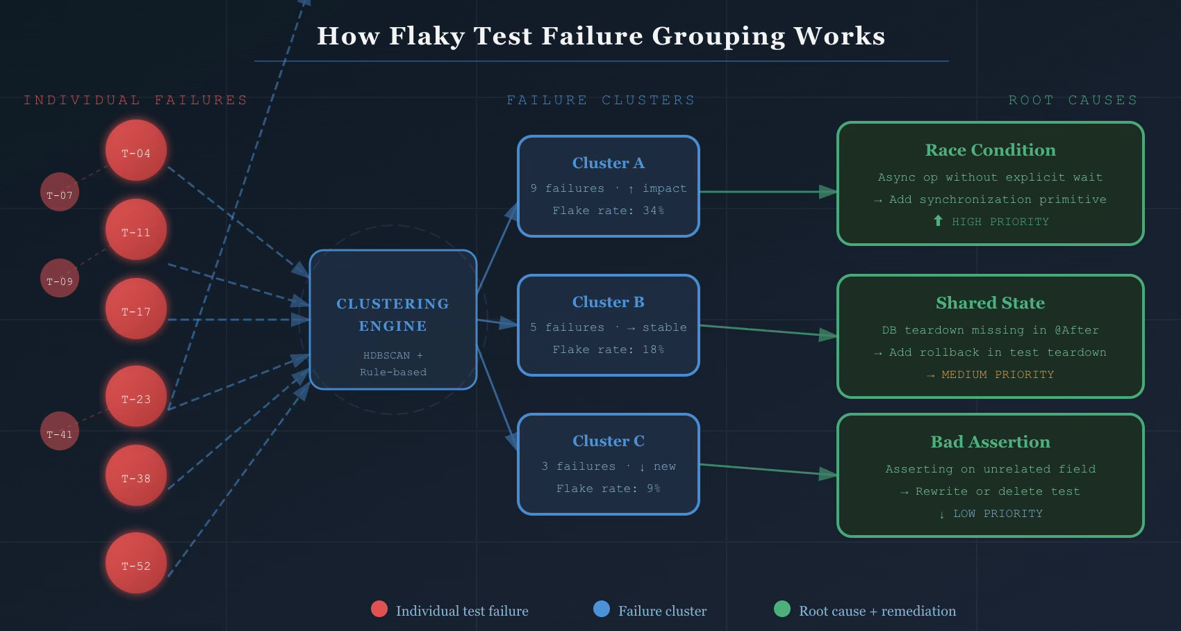
A well-implemented failure grouping system uses a hybrid approach — not pure machine learning, not pure rule-based logic, but both working together.
Similarity-based clustering uses algorithms like HDBSCAN (Hierarchical Density-Based Spatial Clustering) with custom distance metrics applied to:
Stack trace similarity — two failures with 80% overlapping stack frames are almost certainly the same issue
Error message tokenization — normalized error messages compared using token-level similarity (TF-IDF or embedding-based)
Test metadata — suite, module, and ownership signals that help prevent false groupings across unrelated components
The output is a set of clusters where each cluster represents a likely common root cause. No human involvement required to form the initial groups.
Rule-based classification layers on top to label clusters by root cause category. Known patterns — “NullPointerException in @Before method” → shared state; “SocketTimeoutException in service call” → environment sensitivity; “AssertionError on field X which test never sets” → bad assertion — get recognized immediately and routed to the right remediation playbook.
Feature extraction that feeds both layers:
Test name and file path parsing (ownership signals, suite classification)
Failure context: which branch, which environment, what time of day
Historical pass/fail ratio per test (distinguishes newly flaky from chronically flaky)
Correlation with deployments and infrastructure changes
The practical result: ~80% of flaky test failures cluster into patterns that share stack traces and error messages. The top 25 failure clusters typically account for 70% of all test flakiness. You don’t need to fix everything. You need to identify and fix the right things.
The Impact Score
Clustering tells you what’s related. The impact score tells you what to fix first.
A well-designed impact score is a composite metric:
Impact Score = (Failure frequency × 0.3)
             + (Unique PRs blocked × 0.3)
             + (Estimated dev time lost × 0.25)
             + (Recency weight × 0.15)
This surfaces clusters that are both frequent and high-cost — not just the ones that fail the most. A test that fails 50 times on a rarely-used branch matters less than one that fails 10 times and blocks your main branch merge queue.
What the Dashboard Shows
The dashboard translates all of this into four interconnected views:
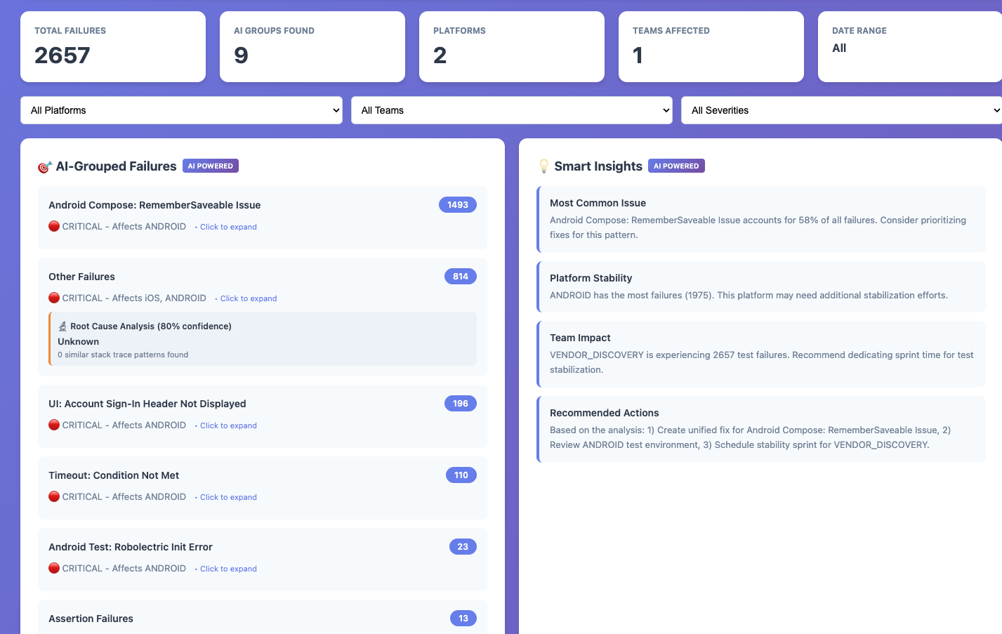
Home — Cluster List: The prioritized view of all active failure clusters, sorted by impact score by default. Each row shows the cluster name, root cause category badge (Timing / State / Environment / Resource / Bad Test / Other), flake rate with trend indicator, failures in the last 7 days, number of affected tests, and current status in the cluster lifecycle. Filters for time range, root cause category, branch, suite, and status. This is the view your on-call engineer opens on Monday morning.
Cluster Detail: Clicking any cluster opens the full picture. A trend chart showing failures over time with deployment annotations. The list of all affected tests with their individual flake rates. Sample failure logs with full stack traces and build context. Pattern analysis — which branches, environments, and hours of day see this failure most. And critically, the root cause recommendation: “This cluster shows characteristics of shared state pollution. Check @Before setup methods and database rollback configuration.” Remediation history, linked tickets, and investigation notes complete the picture.
Individual Test View: Every test in the suite gets its own view — full execution history (pass/fail over time), associated clusters, flakiness score and trend, and quick actions: Quarantine, Skip, or View in codebase. This is where you investigate a specific test someone flagged without needing to navigate through clusters first.
Analytics — Test Health: The macro view across the entire suite. Green build percentage trending over time. Flakiness by root cause category (so you can see if “bad assertions” is growing as a share of failures — a sign of test quality degradation, not just reliability drift). New vs. fixed clusters per sprint. CI/CD cost impact. Remediation velocity: how long does it take your team to go from “identified” to “fixed” for each root cause type?
Pros of the dashboard:
Faster Triage: Automated grouping eliminates manual pattern detection
Reduced Noise: Focus on root causes instead of individual test failures
Better Prioritization: Data-driven decisions on which issues to fix first
Improved Efficiency: Eliminate redundant debugging efforts
Increased Stability: Address systemic issues rather than symptoms
So, Is This Worth It For Your Team?
If you’ve read this far, you’ve probably already mentally mapped this to your own CI pipeline. You know which tests get dismissed every sprint. You know which failures your team re-runs without investigating. You know the engineers who’ve quietly stopped trusting the test suite.
The question isn’t really whether a Flaky Test Analysis Dashboard would help — it almost certainly would. The question is whether your team is ready to treat flaky tests as a first-class engineering problem rather than background noise.
A starting point, not a finish line
The dashboard I’ve described in this article — with its clustering logic, confidence scoring, trend tracking, and platform-specific root cause detection — took several iterations to get right.
But I wanted to share where it all started.
The HTML prototype below is a standalone, zero-dependency version that captures the core idea: stop looking at test failures one by one, and start looking at them as patterns. Load your CSV, and within seconds you get AI-grouped clusters, trend direction, and the root causes most worth your time.
Every team’s failure data looks different. Your stack traces, error codes, and flakiness patterns will push you to adapt the grouping logic, tune the confidence thresholds, and build in context that’s specific to your stack. That’s the point — this is meant to be a thinking tool, not a drop-in solution.
https://github.com/alwayspulkit/FlakeyTestDashboard
Found this useful? I write about engineering productivity, quality systems, and developer tooling. Subscribe for more.
Tags: #SoftwareEngineering #TestAutomation #QualityEngineering #DeveloperExperience #CICD #EngineeringLeadership #TestFlakiness